There's nothing a user interface designer loathes more than complexity. Every design—at least, every modern design—seeks to minimize clicks, icons, visual noise. What if instead of a button, we had a borderless icon? What if instead of navigation controls, we used gestures?
And what if—hear me out—instead of search results, we had language model-distilled text delivered to you, hot and fresh?
I've been thinking a lot about interfaces in the modern era. What we're presented is not always what is best. Hell, most of our ideas about what computers should look like come from science fiction. Is there any doubt that Star Trek is directly responsible for the prevalence of touchscreen interfaces? Would there be an iPad without the PADD?
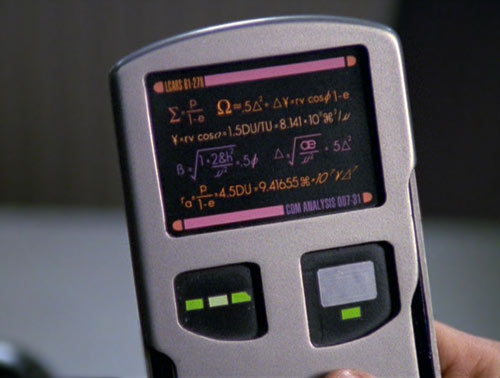
Mike and Denise Okuda are masters of their craft. I dig on LCARS more than anyone, but those designs were created to tell a story, not be highly functional for real people in real life.
The same can be said of virtual and augmented reality. Who even decided we needed or wanted little screens in front of our face all day, anyway? Was using a computer so limiting that we need to expand our display options into the vastness of the room around us?
Is this how we want to watch our movies: alone in our headset, perhaps bumping into the obscured faces of your families as you all watch "together" in some faceless corpo dystopia? Is this how we want our computing to be? Ubiquitous, and fused with reality by way of small displays millimeters from our eyes, making our myopia epidemic even worse?
So yeah, I've been thinking a lot about interfaces—how the ways we interact with our technology are driven by agendas entirely detached from how best to use a thing. Imagine if a hammer's grip were designed not to hold the hammer, but to sell you a certain brand of nail. Utterly ridiculous, I know, and yet, isn't that our exact predicament here in the Realm of Silicon?
Consider the Windows Start Menu:
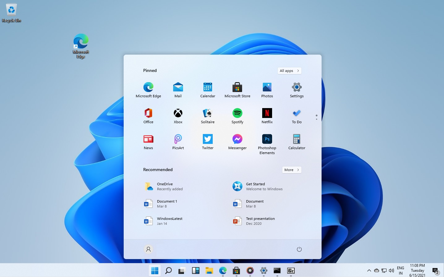
This thing's ostensible purpose is to provide access to applications and files on the computer. That's the central mission. Ideally, you should be able to interact with it the way you interact with a computer elsewhere (i.e.,a keyboard and a mouse). You could browse. See a comprehensive list of installed applications.
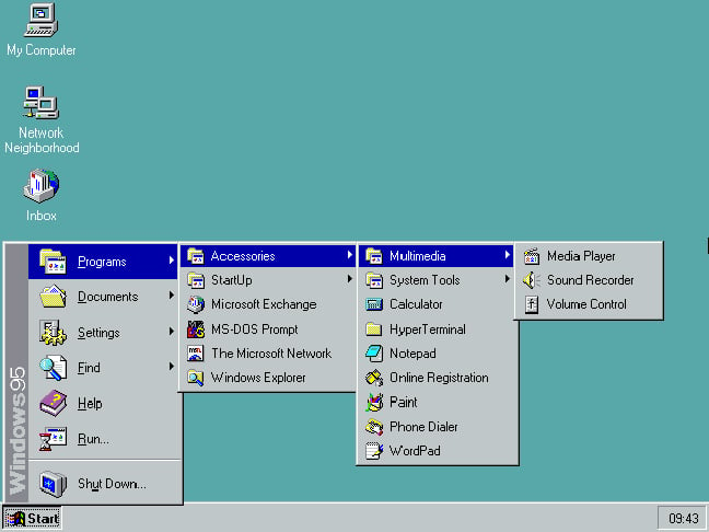
That's how it used to be. We can debate about the usability of pop-over chains, but there's no doubt that the Windows 95 Start Menu functioned.
Is the new design "cleaner?" More centralized, more symmetrical maybe, but does it improve access to the information it's supposed to provide?
Kiiiiiinda.
See, the Start Menu no longer does what you think it does. It isn't a tool for navigating the computer; it's an engagement vector. If we look at that Windows 11 image closely, we'll see that the "pinned" default apps are mostly third-party. It turns out most of them aren't even installed. Those are ads, friends. What's worse, they're dark patterns, designed to trick you into thinking those apps are already present and waiting for you. The Start Menu is essentially a small window (pun intended) into the Windows Store. Its purpose is no longer to inform, but to sell. The necessary information isn't entirely discarded, but it is literally placed below the ads in a visual hierarchy.
The interface isn't serving you; it's serving corporate strategy and revenue.
Windows was a near-to-hand example, but far from the only one. Our interaction points with technology have shifted from designed-for-use to designed-for-sales. Perhaps the most apparent—and the most troubling—is the trajectory of search.
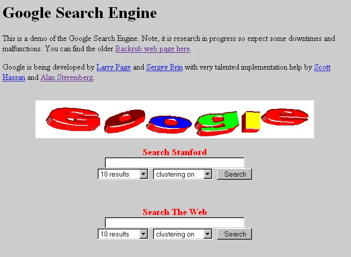
I was there, Gandalf. I was there three thousand years ago, when the principles of search failed.

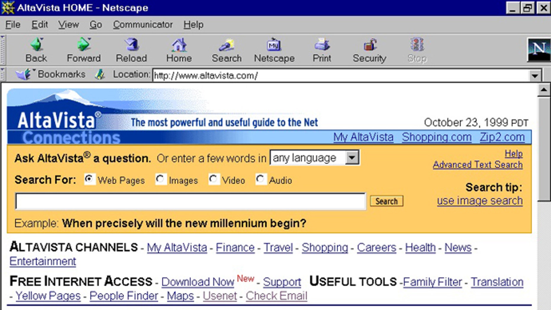
Images courtesy of the Version Museum
Let's admit the obvious: search has gotten significantly worse in the last few years. We can no longer rely on search engines—perhaps especially Google—to deliver meaningful results for what we searched for. What it delivers instead is a regression to the mean: the same handful of popular sites every time, along with ads that may or may not be malware. The results aren't even paginated anymore, allowing you to helpfully jump past the algorithm's first choices, to the parts of the web containing information, not engagement.
And what is the interface for search anymore? Is it visiting Google Dot Com? Typing in the address bar? The entry points to search are so diffuse, they are impossible to enumerate. So many products have opaquely integrated search into their products, we come to expect it in places that have nothing to do with "searching the internet."
To hazard a definition: "A blank text box positioned prominently in the interface." When we type into the Start Menu, suddenly we are also searching the web. When we use Spotlight on macOS. The search box in iOS that ostensibly helps you find apps. Of course, the same such box in Android.
We search even when we don't want to search, or at least don't intend to. The reasons behind this design are myriad, but they include both a corporate strategy to deliver you to potential business partners, and a design strategy to make your device feel clairvoyant.
"I didn't know I wanted to see that, but I do!" *click*. That's the response designers are after. And it works because it's engineered to work. Your little dopamine-seeking skullmeat never had a chance.
But there remains an inelegance to the whole affair, wouldn't you agree? This whole "list of results" situation, requiring you to laboriously discern which result is the one you want, then evaluating that information for credulity and thoroughness?
In a word: yikes.
But now, designers have a new tool at their disposal: the Large Language Model. Who needs the extra clicks and eye fatigue of all that raw data. Oh, and let's not even talk about users having to negotiate the various designs of different websites. What a hassle! So instead, let's not even bother with that part. Let's point the results at our trained language model, and have it summarize the results. No need for clickthroughs—or revenue for those source sites—just pure content.
It might even be accurate.
And hey, since we control the model, why not incentivize it to mention our advertising partners? Don't forget our own vertical integrations!
That's much better: a single returned result in an interface component that matches our aesthetic, and with requires no additional effort or interactions from the user. This is perfect.
This is the future.
Hopefully that last bit was clearly parody. But the true aims of designers are not far off. The mad rush in Silicon Valley to put generative models in every technology that moves will result in the model's output being the focus of the user interface. In some cases, it will be the entirety of the interface. Look no further than what's happening with Edge. Every aspect of the, uh, "web browser," is begging you, outside your door in the rain, to use the AI features on the sidebar. In essence, it wants you to let it browse the web for you. Or just, like, plagiarize some artwork for funsies.
As I've written before, the results from LLMs do not have to be perfect for people to accept them. They have to be good enough, and more importantly, quickly available. People are not after truth; they are generally speaking not after facts. They are after answers. LLMs present answers immediately, without the faffery of reading a list of search results, selecting one, and reading through the page to find the answer.
That convenience outweighs most inaccuracies—a fact I think most skeptics miss.
How long is the attention span of the average information seeker? Here, we're not discussing the dedicated scholar or professional attempting to find specific information to solve a technical problem. I'm asking how long the attention span is for, say, a search of symptoms. Or political questions. Or basic scientific facts. These are not searchers who want to compare and contrast multiple information sources. They want an answer, and they want it right now.
So imagine a future internet where you are presented—even more prominently than now—with naught but a text box and a blinking cursor. You type in your question, and what you get first (therefore, for most searches last), is text generated by a language model. There is a small disclaimer at the bottom about the accuracy of the results.
There is no disclaimer about the embedded ads disguised as recommendations.
Want to search the web yourself? Dark patterns make it extremely annoying to do so. Too complex for most users, designers will say. The nerds will continue using "legacy" browsers, perhaps even on a separate internet from what most users experience. This "oldweb" will be the domain of small blogs, long essays, and yes: even human-generated art. But this will be a niche community, vanishingly small in comparison to the new web. This will be the internet of models and connected services, which have license agreements to allow the models access. All of this is controlled by entities so large as to be beyond competition. You are presented content and ads, one indistinguishable from the other. This is all you are presented when you "search."
But oh, how elegant the interface will be.